

Home Page Hero - 1 and 2
This is a two-column section for your home page hero section. We’ve given you the ability to play with the button here - Choose between a standard button or a select a pre-designed CTA on your HubSpot account.
Another interesting feature to note here is that you can re-emphasize the action with a secondary text placed beside the button.
In the rich text editor, your bullet points will be be designed beautifully without touching the code!
Home Page Hero - 3
Another great option to create the hero section of your home page, or any of the highly important pages. Replace the background image here and choose between the button or any CTA you already have in your HubSpot account.

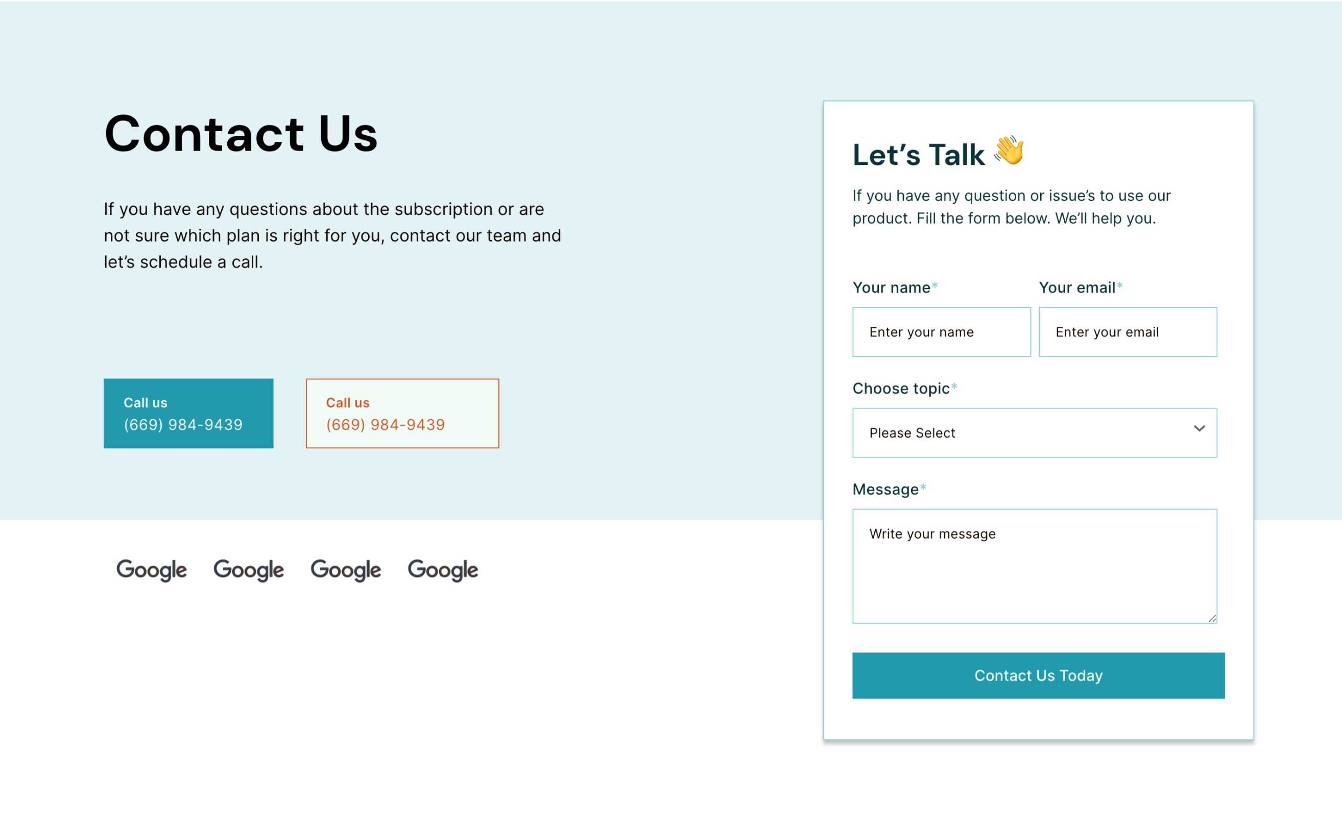
Contact Page Hero
This hero section is specifically for your Contact Page. It is a two-column section that has the form on the right side.
It has an option to have up to two buttons, so use them for sharing the email address, and phone number. Below these buttons, you can choose to add as many client or partner logos as you want.
Hero Section - About
This is a two-column section where the image comes on the right side, and the text comes on the left. Choose the image to be contained within the section or set as a background of the right column.
On the left column, you have the option to use a button or CTA, if needed.

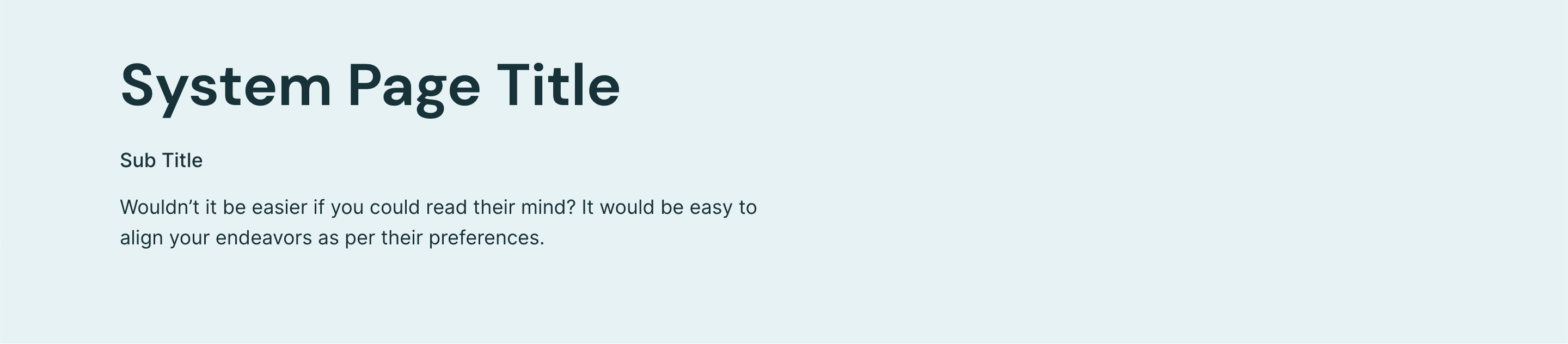
Hero Section - System Page
This is the simplest hero section which is going to the top of your system pages, like error pages, and email subscription pages.
Content With Image Column
Beautifully laid-out bullet heads with icons and descriptions. Add as many bullets as you need here to make your point.
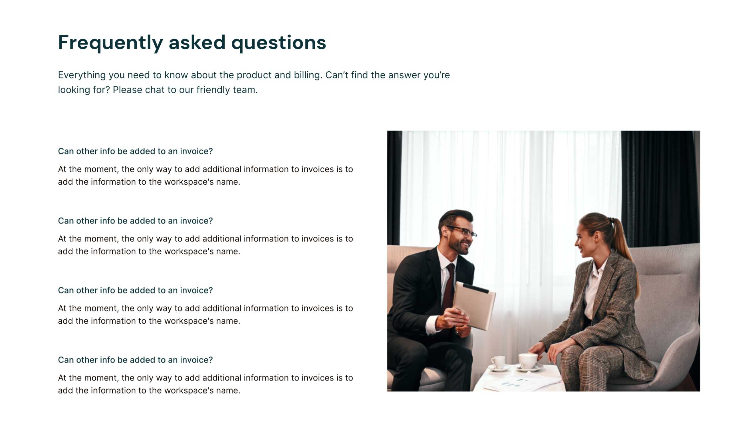
FAQ
This is a two-column section with an image on the right and Q&As on the left. You can add as many questions and answers as relevant.
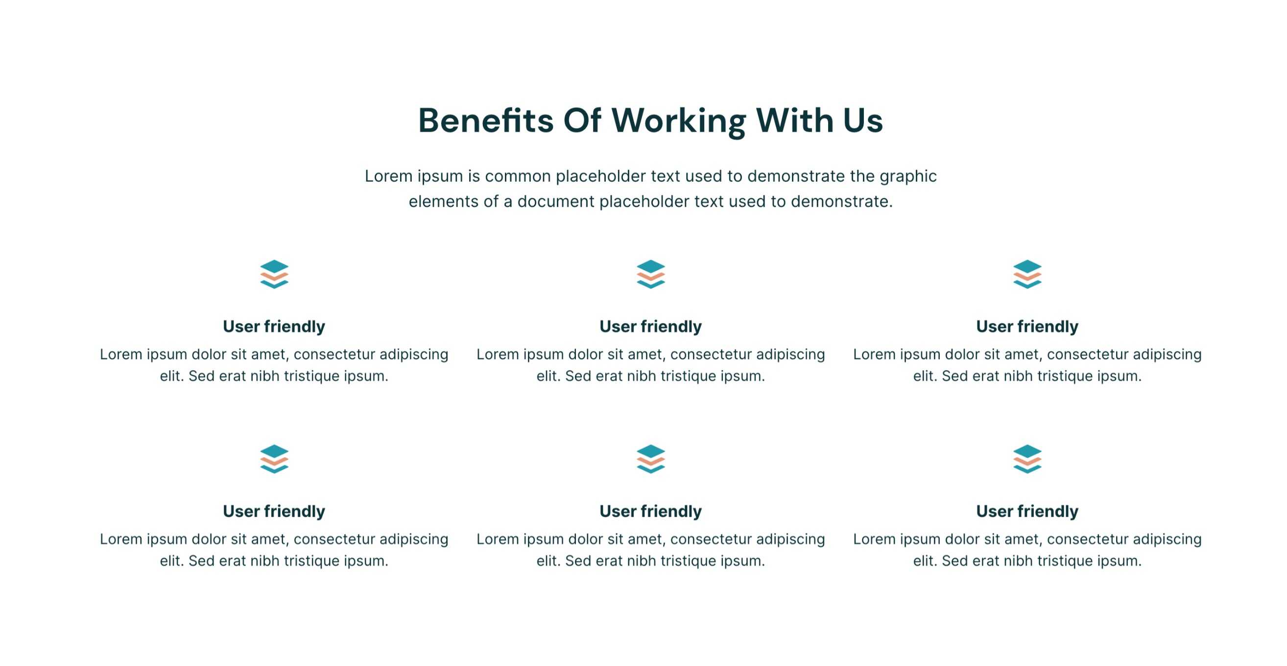
Benefits
This is a collection of icons and description units that are arranged in a grid style. You may add as many units as you want.
This section has the capability to switch between two drastically different arrangements - Either everything is center-aligned or the whole section is left-aligned.
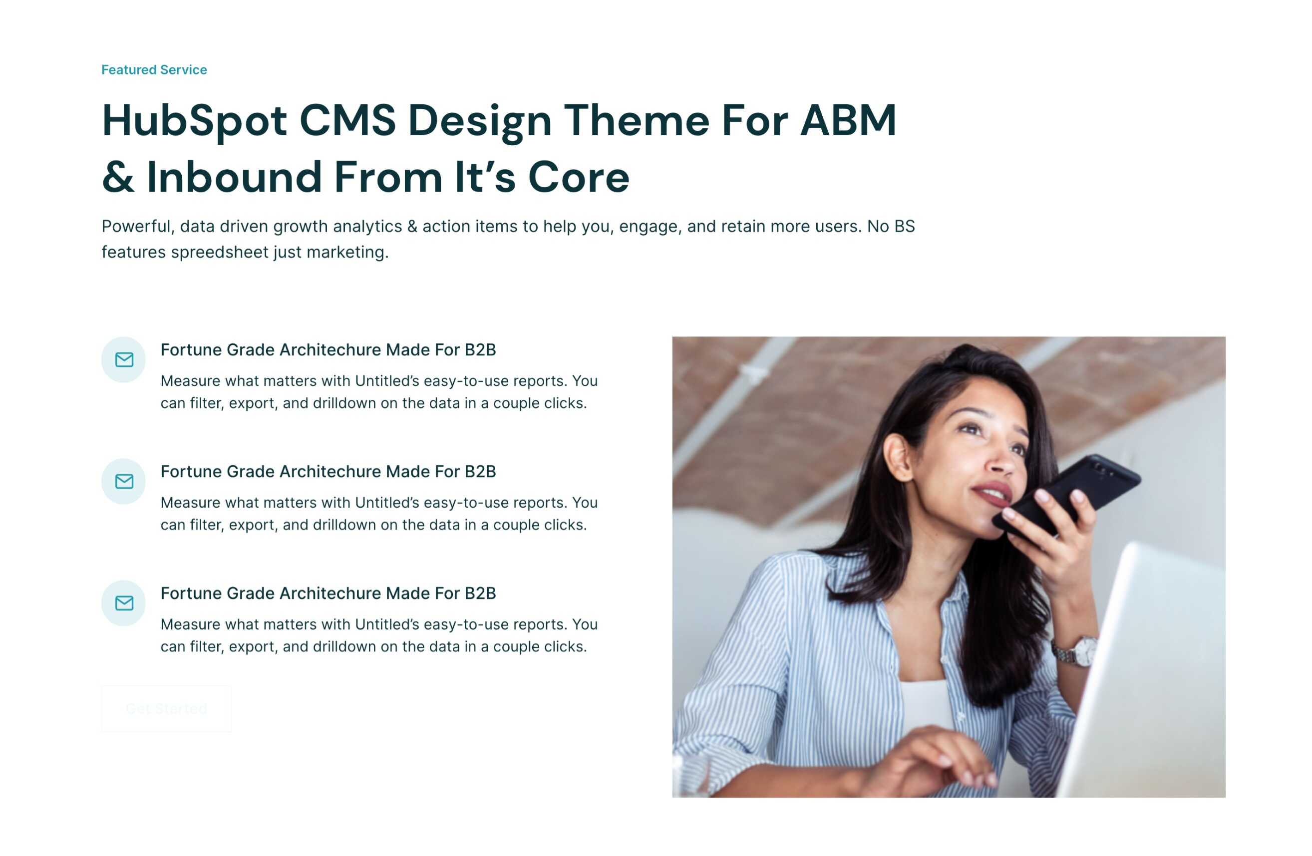
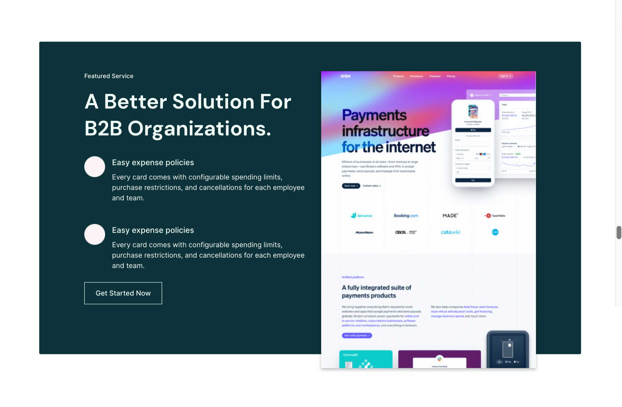
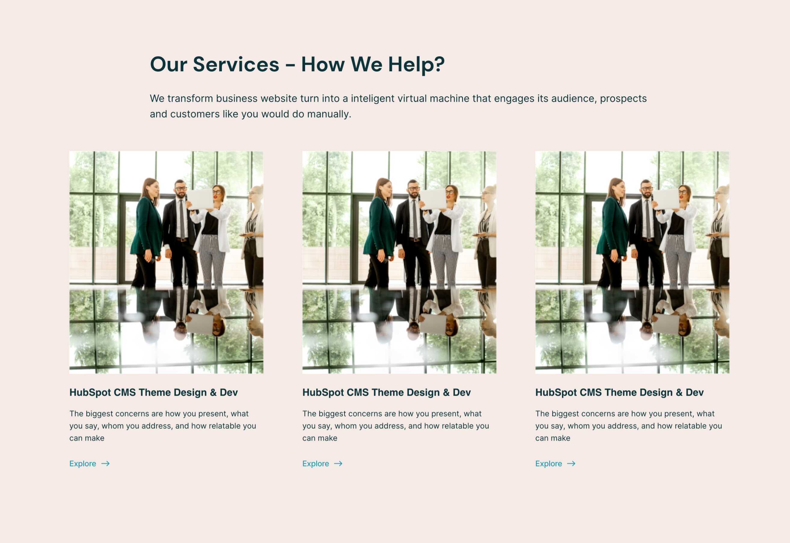
Featured Services
This is a beautiful dark two-column section to talk about one of your featured offers or services. In the left column, it has a bullet list structure with icons, titles, and descriptions to highlight some specifics about this featured service.
The button styling in this section is unique from the other buttons in this theme. It is an outline-only button, which you can switch with any pre-designed CTA in your HubSpot account.
The right column is for an image.
Features Card List
To explain the nitty-gritty of your product or service, use this section where you can add as many features as you need. This section has cards arranged in a grid of 3 columns.
The buttons in each card could be linked to anything like a page from your website, external link, HubSpot file, email address, or blog post on your domain.
Left Image With Features
This module is a combination of an image and icon sections. In every icon section, you can replace the icons, titles, and descriptions. Add as many icon sections as you need, and they will automatically be arranged in two columns.
Milestone
Display your milestones and achievements in numbers or anything that can be highlighted in brief. This section is uniquely structured where you can change the value, the suffix, and a little description to tag along.
Now, you can add as many milestones as you need, and they’d show up in 2-column style.

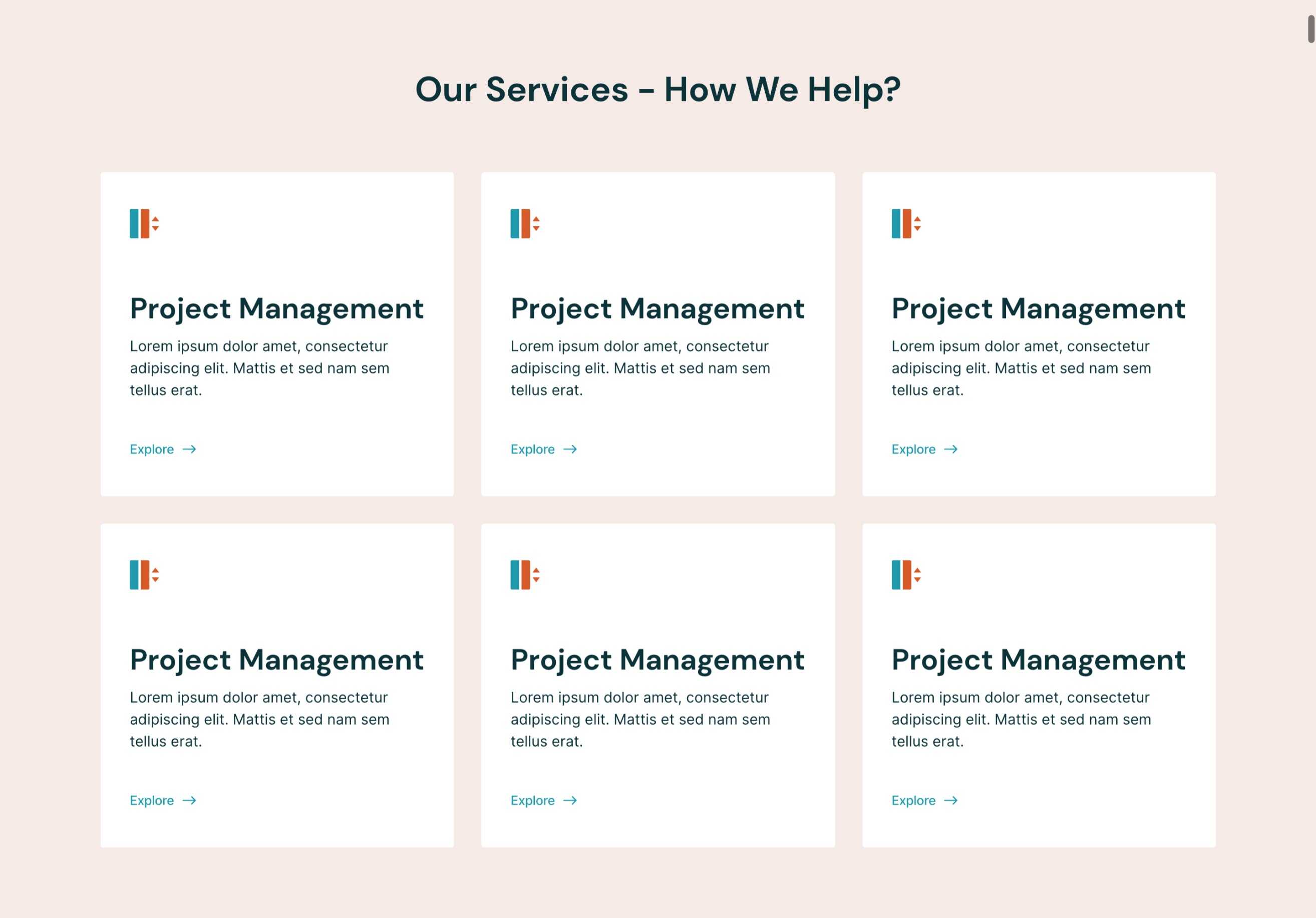
Services
This section is designed as a set of cards that you could use to redirect your website visitors to a specific page. 100% editable, add as many cards you need without disturbing the responsiveness of this section.
You also have the option to switch between cards (as you see in the image here) and two-column section arranged one below the other.
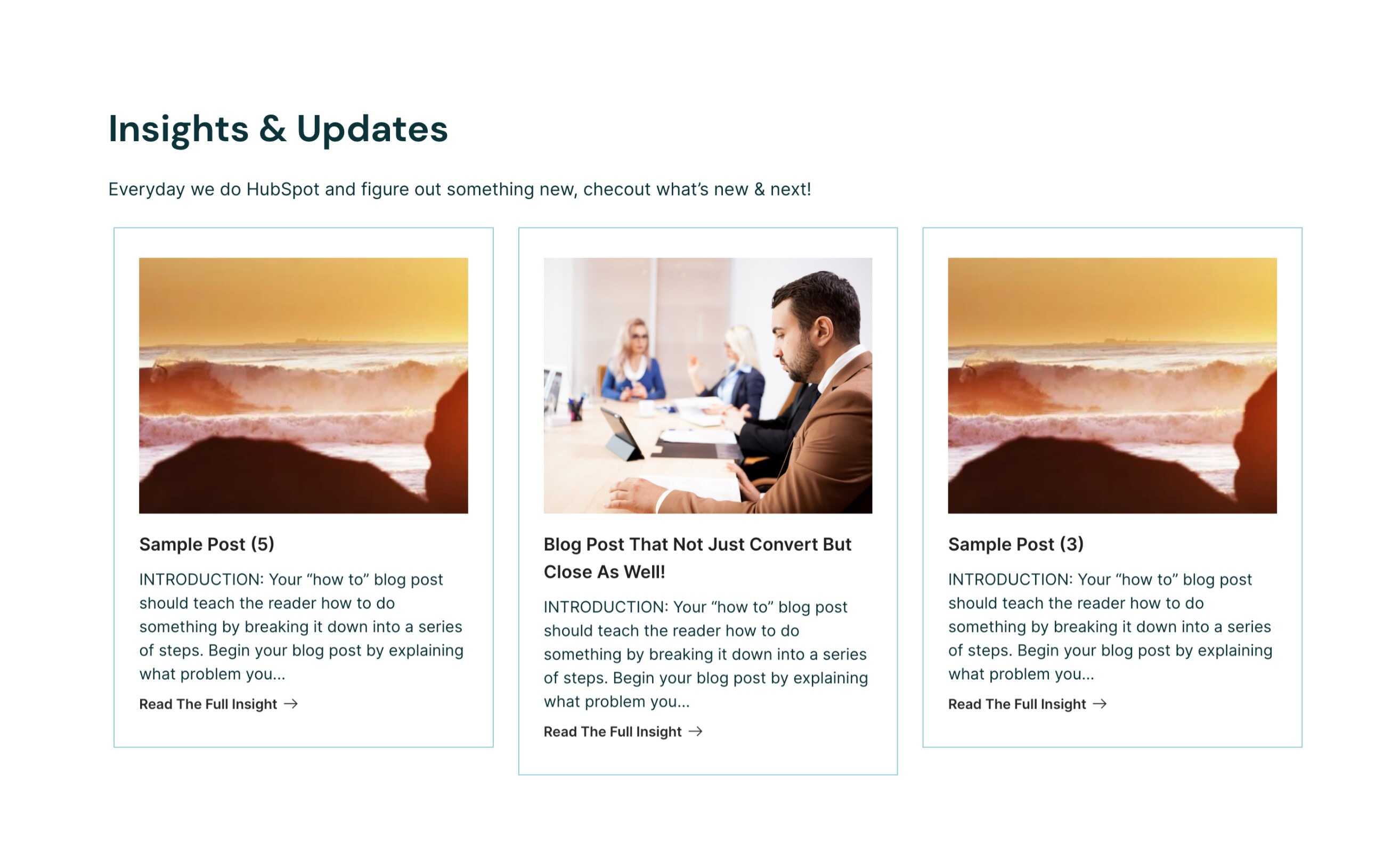
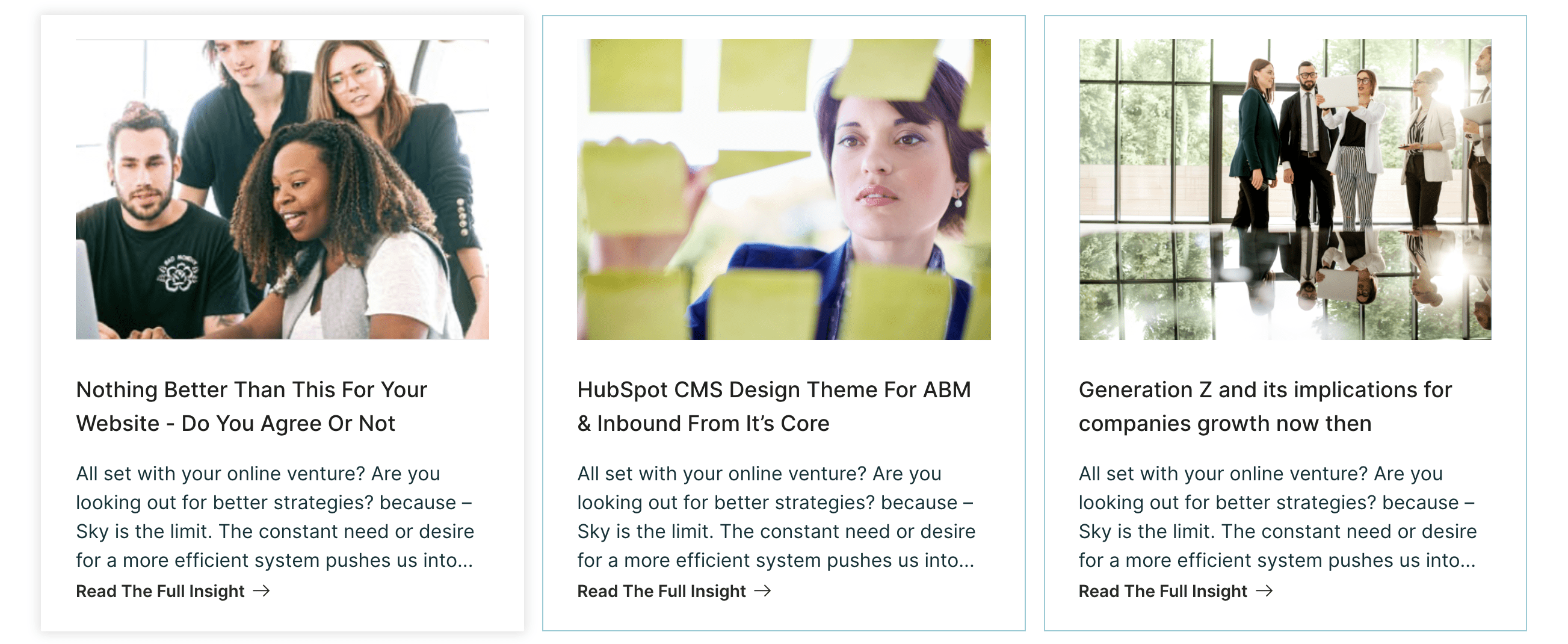
Recent Blog Posts
Select the blog you want to use from the left sidebar, and start editing this 3-column section how you want to see the final outcome.
You may change the number of posts you want to display. You can also choose to show or hide the individual blog post details like featured image, title, description, and button.
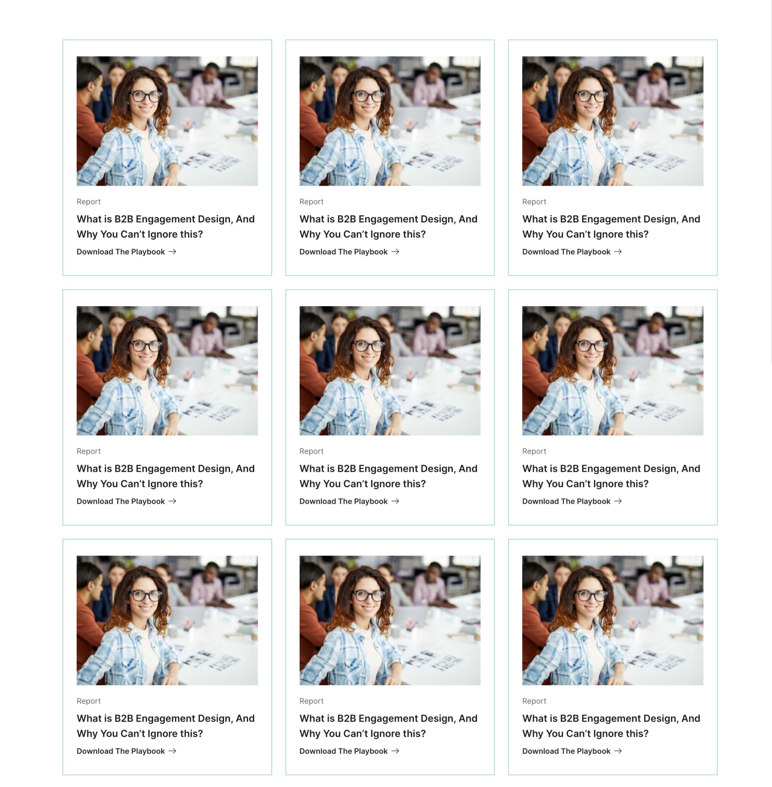
Resources Listing
This section is exactly what the name tells. All your resources like report, ebooks, whitepapers, videos, podcasts etc could be all in one place. This is a three-column section where you can add any number of resources you want.
Every card can be edited for that resource’s image, title, description, tag (report, ebook, video, etc), and the URL. The best part is that you can have external URLs or the content hosted on HubSpot, both in one place.
Testimonial Slider
This is a slider section where you can add as many testimonials as you have. Edit the testimonial author’s image, name, title, and speech.
Adjust your ratings for every testimonial from 1-2-3-4-5 and that will show up as stars.

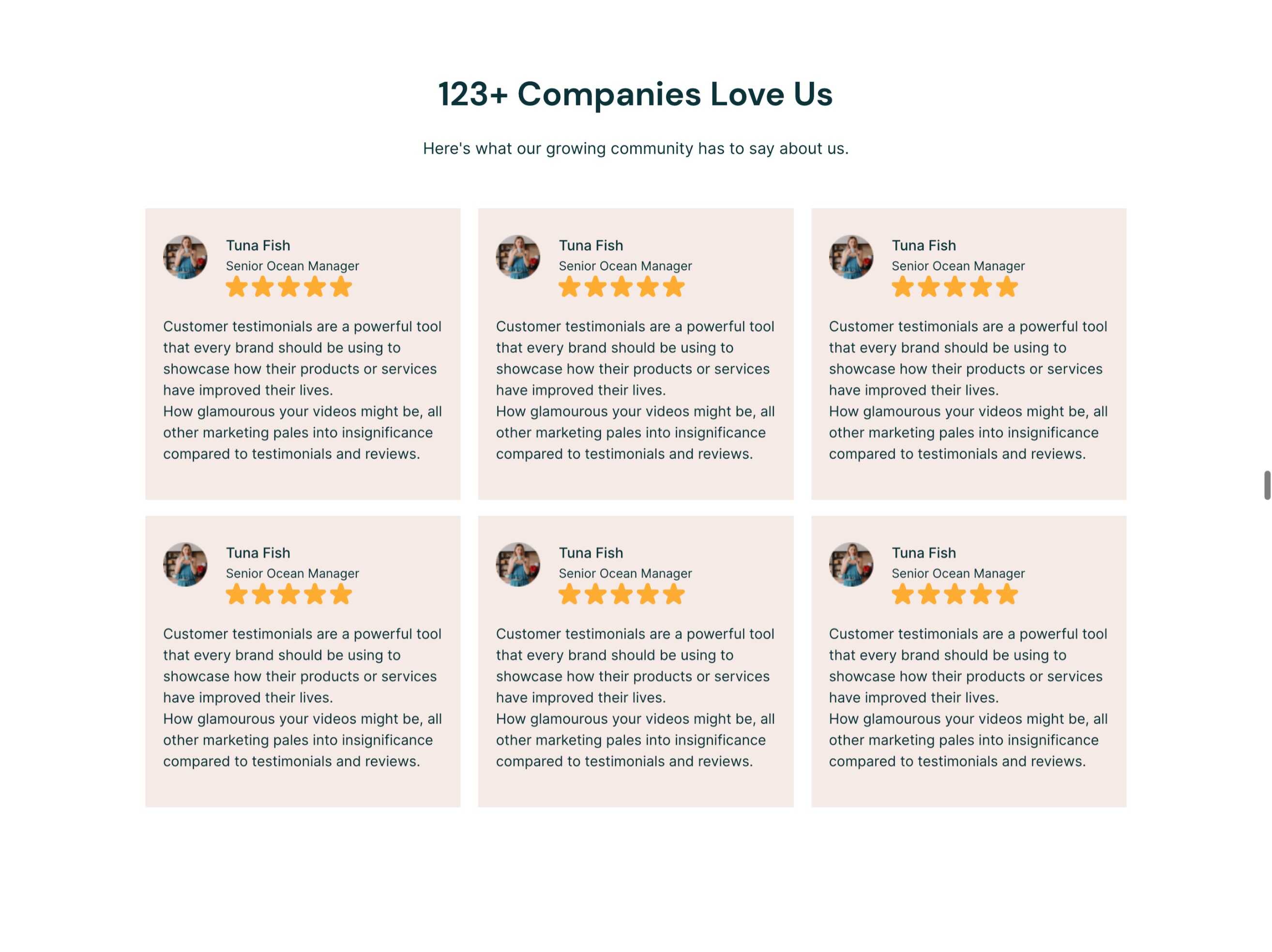
Testimonials
Use this when you have multiple testimonials to arrange in a beautiful grid-like section. Add as many as you want!
What more? You can control the rating for every testimonial (1-2-3-4-5) that comes out as stars.
Your testimonials author’s image, name, title and the speech can be edited 100%.
Two Column Content With Image
As the name says, this two-column section has an image in one of the columns, you can switch between left and right placement. You can choose to have a button or a pre-designed CTA on the text side of this module.

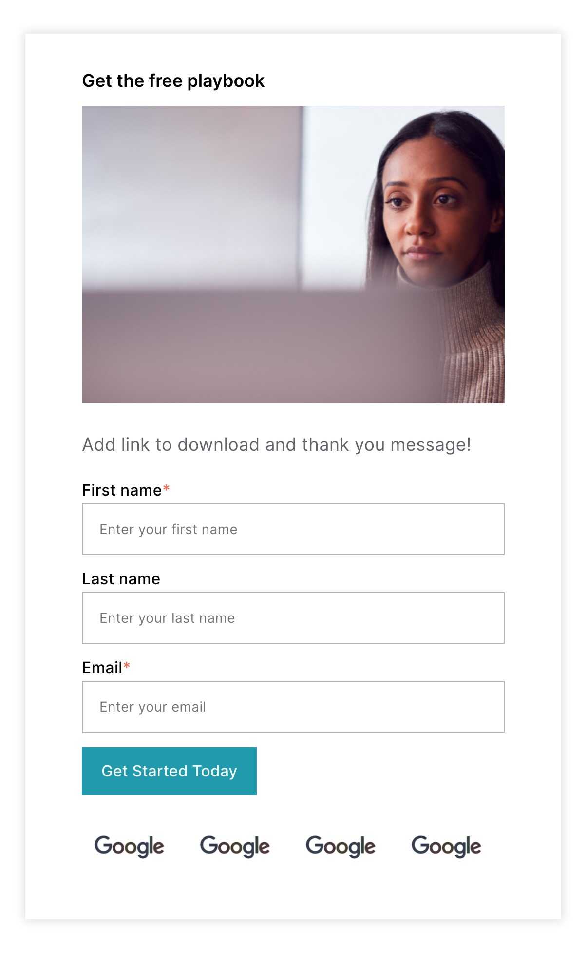
Resource Download Form
This form module is specifically designed to be used on your landing pages to let people download your resources. You can edit the title and image in this module, and select the form. You may also replace the client and partner logos, and add as many of them as you need.
Blog Listing
This form module is specifically designed to be used on your landing pages to let people download your resources. You can edit the title and image in this module, and select the form. You may also replace the client and partner logos, and add as many of them as you need.
Blog Header
This form module is specifically designed to be used on your landing pages to let people download your resources. You can edit the title and image in this module, and select the form. You may also replace the client and partner logos, and add as many of them as you need.

Button
Our button module is fully equipped to be edited as per your needs. You can change its border style (solid, dotted, dashed, double), radius, spacing, and color. You may make it left, right, or center aligned.

Bottom CTA
This is a neat arrangement to build your CTA section for the page bottom. You can replace the button with a pre-designed CTA in your HubSpot account.
You have the option to add logos of your clients or partners below the button, add as many as you want.

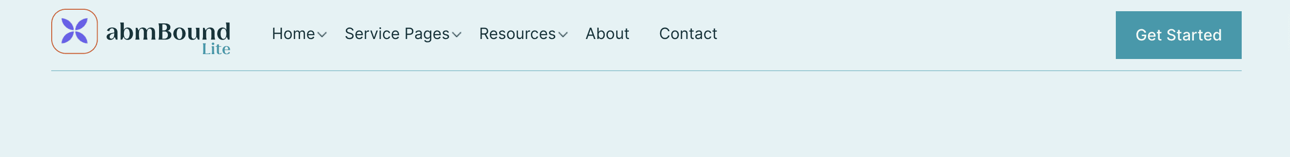
Menu
This is your menu bar or navigation bar visible on all pages. Select the correct navigation in this module. You can edit the border style, background color, and text color for your menu fin this module.
Social Links With Icons
Add all your social media account links in this module, and it will come responsive and well-designed as you see in the theme files. You can also choose between circular or square social icon shapes.

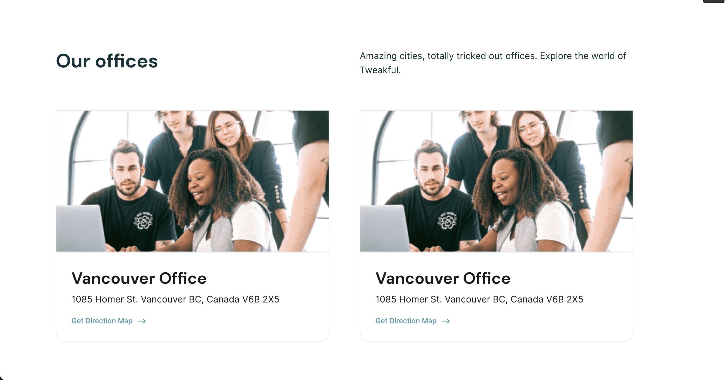
Contact Info
This is where you can add your company addresses. Use separate cards for each address, and add as many. You can edit the location name, address, images and map links.